
01 · Identity · Logo Design
ICEUR: Brand Identity Concept
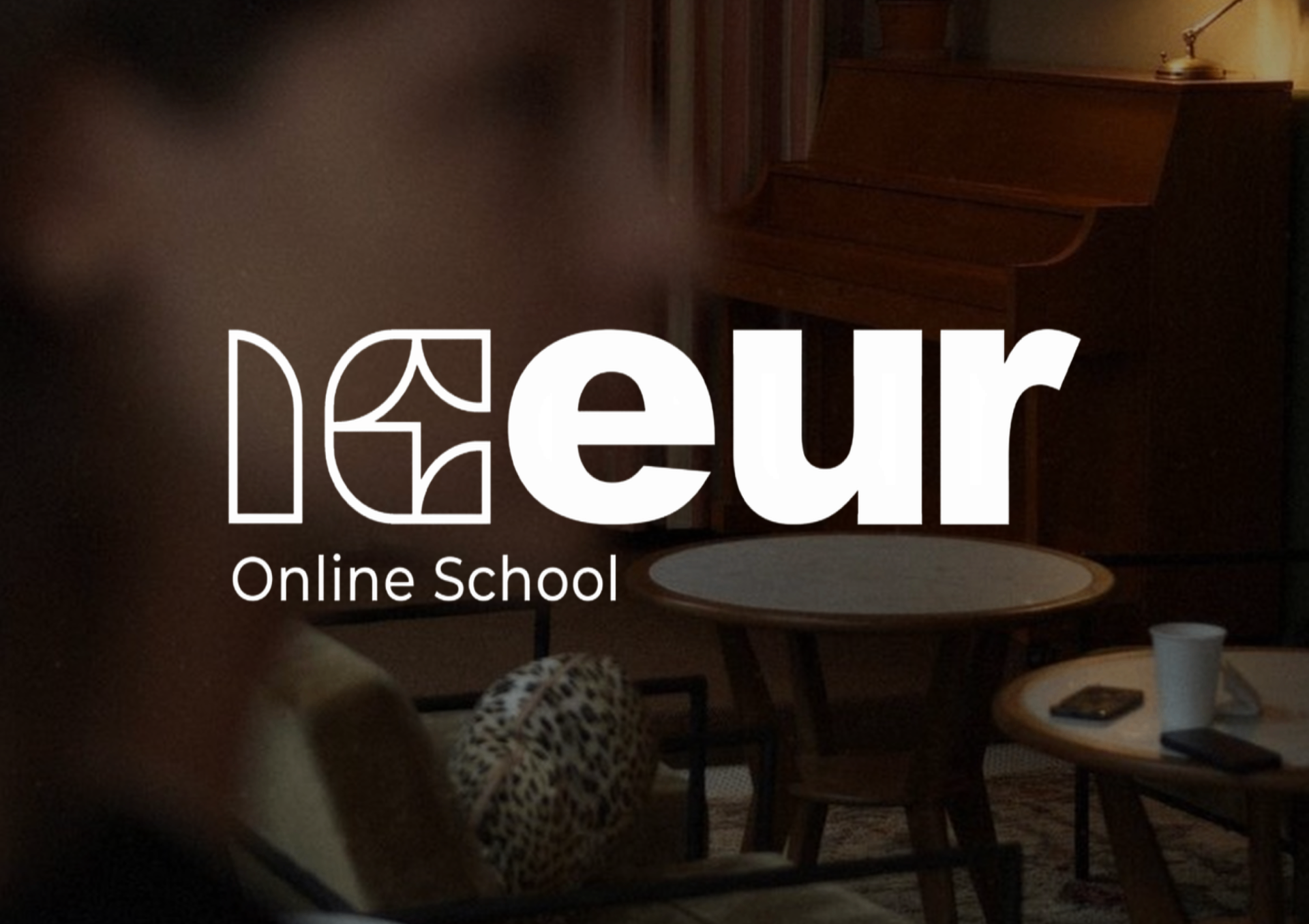
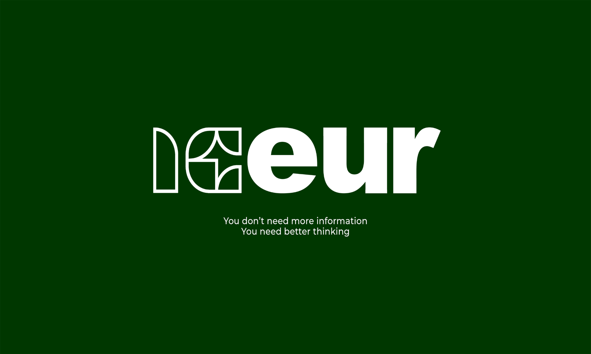
The ICEUR logo is engineered as a visual metaphor for the brand’s core philosophy: you don’t need more information, you need better thinking. The design illustrates a deliberate journey from complexity to absolute clarity.
The Left Side (ic) utilizes a structured system of forms reflecting the raw thinking process, decomposition, deep analysis, and the search for connections. It is the visual embodiment of thoughts still in motion.
The Right Side (eur) shifts into clean, confident typography, symbolizing the ultimate outcome, clarity and a formulated conclusion.
Minimalism here is driven by intent, not just style: every unnecessary element is stripped away to emphasize the core message, thinking as a transformative process.